made to measure
Here are some of the websites, visual identities and print designs I’ve worked on.
Each project brings different needs, constraints and styles. The goal is always the same: to create something useful, cohesive and distinctive.
Web projects
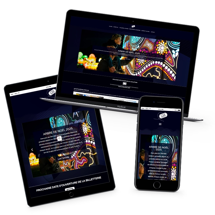
CSE SOPROCOS (L'ORÉAL PARIS)
THE PROJECT
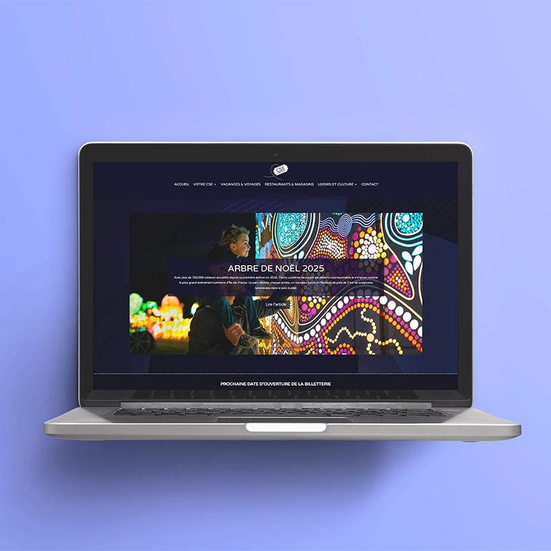
A secure website for a works council in Gauchy, near Saint-Quentin, designed to bring information together and make it easier for employees to access.
BEHIND THE SCENES
Designed as a central hub for information and internal communications, it helps employeesquickly access news, benefits and services offered by the works council.
Available to employees only, the site provides a secure, private space for sharing internal information.
The site was structured to provide clear, quick navigation, facilitant la consultation des contenus et l’accès aux informations essentielles.
Une attention particulière a été portée à la content management and giving the teams control, so they can make everyday updates quickly and easily.
Projet réalisé dans un contexte d’structured corporate environment (L’Oréal Group), nécessitant care and clarity inorganisation des contenus.
An internal website that makes it easier for employees to communicate and quickly find the information they need.
This website contains confidential internal information, including meeting minutes and documents for employees. It is therefore unavailable to the public.
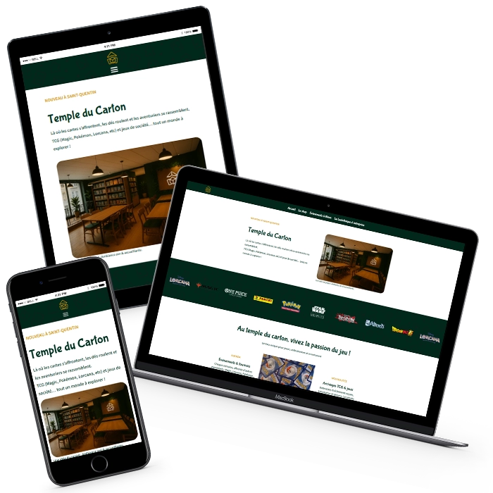
temple du carton
THE PROJECT
A website for a board game and trading card shop in Saint-Quentin, designed to bring players together for events, tournaments and games in store.
BEHIND THE SCENES
Le Temple du Carton est une board game and trading card shop, located at 12 rue du Gouvernement in Saint-Quentin.
For this project, I designed the website, as well as the shop’s logo, visual identity and storefront, giving the website and the physical shop a consistent look.
The website is a starting point for exploring the shop, its events, tournaments and play area, where players can get together around a table.
In the play area, I set up a system of QR codes placed inside the game boxes, so players can scan them and instantly access the game rules in video or PDF formaton their phones.
The website design reflects the atmosphere of the shop, with a warm, playful look that draws visitors into a lively space where cards clash, dice roll and players get together for a game.
The website extends the shop experience online, making it easier for players to discover the venue, find game rules and organise community events.
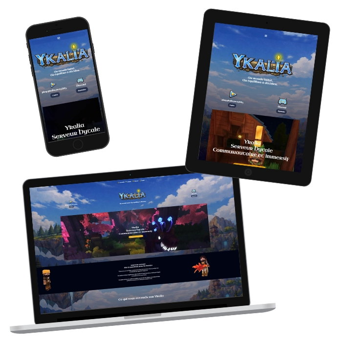
THE PROJECT
A community website for a Hytale server, designed to introduce players to its game world and bring the community together online.
BEHIND THE SCENES
For this project, I designed the website, which introduces players to the project and its world and gives them the information they need.
The website is a starting point for exploring the world of Ykalia, keeping up with the server and joining the community.
I also created the story world for the project, writing quests and story elements to enrich the player experience.
The website gives players a way into the server’s world, where they can explore it and join a growing community.
ykalia
THE PROJECT
A community website for a Hytale server, designed to introduce players to its game world and bring the community together online.
BEHIND THE SCENES
For this project, I designed the website, which introduces players to the project and its world and gives them the information they need.
The website is a starting point for exploring the world of Ykalia, keeping up with the server and joining the community.
I also created the story world for the project, writing quests and story elements to enrich the player experience.
The website gives players a way into the server’s world, where they can explore it and join a growing community.
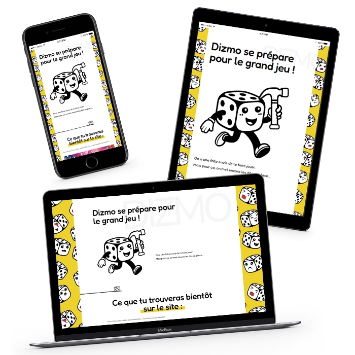
THE PROJECT
A launch page designed to establish the project and grab visitors’ attention from the first interaction.
BEHIND THE SCENES
Goal: secure the domain name, establish the visual identity and start building awareness of the brand.
This first step creates an immediate online presence, while laying the groundwork for the full website.
The page acts as an initial point of contact, designed to grab visitors’ attention and introduce them to the Dizmo brand.
The page serves as an introduction, like a loading screen before a game starts, giving visitors a first glimpse of the project.
A launch page that establishes the project’s online presence and prepares the way for the full experience.
dizmo
THE PROJECT
A launch page designed to establish the project and grab visitors’ attention from the first interaction.
BEHIND THE SCENES
Goal: secure the domain name, establish the visual identity and start building awareness of the brand.
This first step creates an immediate online presence, while laying the groundwork for the full website.
The page acts as an initial point of contact, designed to grab visitors’ attention and introduce them to the Dizmo brand.
The page serves as an introduction, like a loading screen before a game starts, giving visitors a first glimpse of the project.
A launch page that establishes the project’s online presence and prepares the way for the full experience.
THE PROJECT
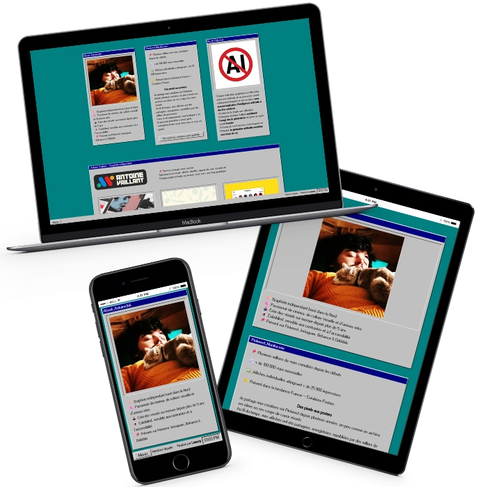
An immersive website with an interactive interface inspired by Windows 95 and an online poster shop.
BEHIND THE SCENES
Design of a bespoke website for a graphic designer based in Lens who specialises in posters and printed artwork.
The project uses a retro visual style inspired by Windows 95, making the interactive experience instantly recognisable.
The interface takes its cues from a desktop environment, where each section opens in its own window, inviting visitors to explore the different collections and services at their own pace.
The project also includes an online shop for posters and artwork, where the designer can sell their work directly.
Individual screens, such as “Exit site” and “404 error”, are interactive scenes in their own right, with computer-inspired animations and messages that make the experience more immersive.
The shop offers a selection of posters and stickers, complementing the designer’s services and generating online sales.
A complete interactive experience that combines a strong visual identity, immersive navigation and an integrated online shop.
THE PROJECT
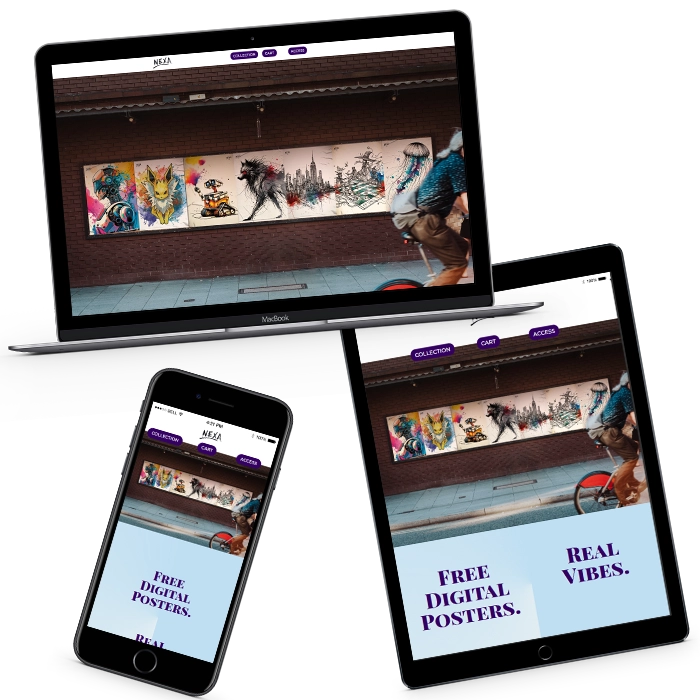
A platform offering instantly downloadable digital artwork to an international audience.
BEHIND THE SCENES
The site offers artwork grouped by theme, with easy navigation and a well-organised catalogue, helping users quickly find artwork that suits their needs.
The platform is easy to use and gives visitors instant access to files directly from the site, with no printing or delivery required, making it a flexible option for decoration, communications and content creation.
The artwork is designed to be easy to use across different formats, whether in print or online (Canva, social media and other visual materials).
Nexa Print serves a wide international audience, with a simple way to access the artwork.
The project works as a bibliothèque de visuels prête à l’emploi, where each design can be used straight away, adapted or incorporated as needed.
A platform that makes artwork easy to access, with fast, direct downloads.
THE PROJECT
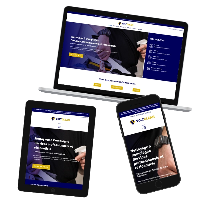
A website designed to generate online quote requests in Compiègne and the surrounding area, in a competitive local market.
BEHIND THE SCENES
Visitors can quickly browse all the services, get clear information and request a quote online in a few steps.
In a competitive local market, a Google Ads campaign was also launched to attract relevant visitors and help people find the site from day one.
The site structure was optimised for local searches, as part of a strategy that combines organic search and paid advertising.
The whole site was designed for direct conversions, with a straightforward path from browsing to making an enquiry.
A website designed to attract local visitors and turn qualified enquiries into appointments.
THE PROJECT
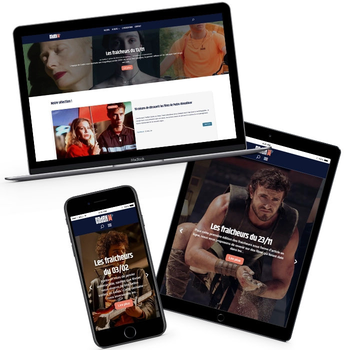
A collaborative blog that allows an association to publish and manage its own content.
BEHIND THE SCENES
I designed a film website for an association to serve as a publishing platform for organising and sharing content about cinema.
The site was designed to showcase articles, make them easy to read and help visitors move between posts.
It includes a user account system, so several members can publish and manage content independently.
I also provided support to train users to manage the website and write content, so the team could run it independently over time.
A collaborative publishing website that lets the team create and manage its own content.
logos & visual design
temple du carton
THE PROJECT
Design of the logo, visual identity and communications materials for Temple du Carton, a board game and trading card shop in Saint-Quentin.
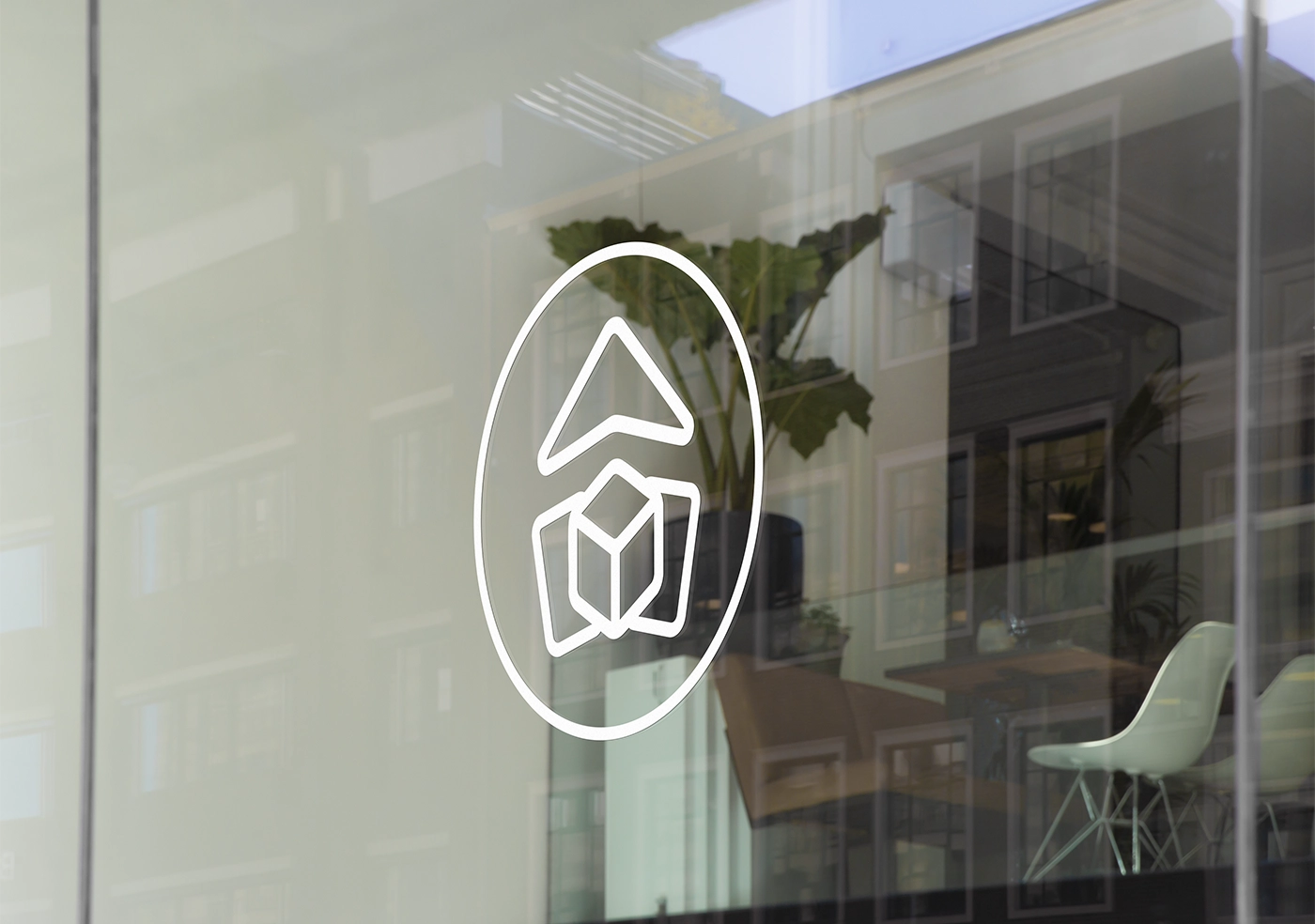
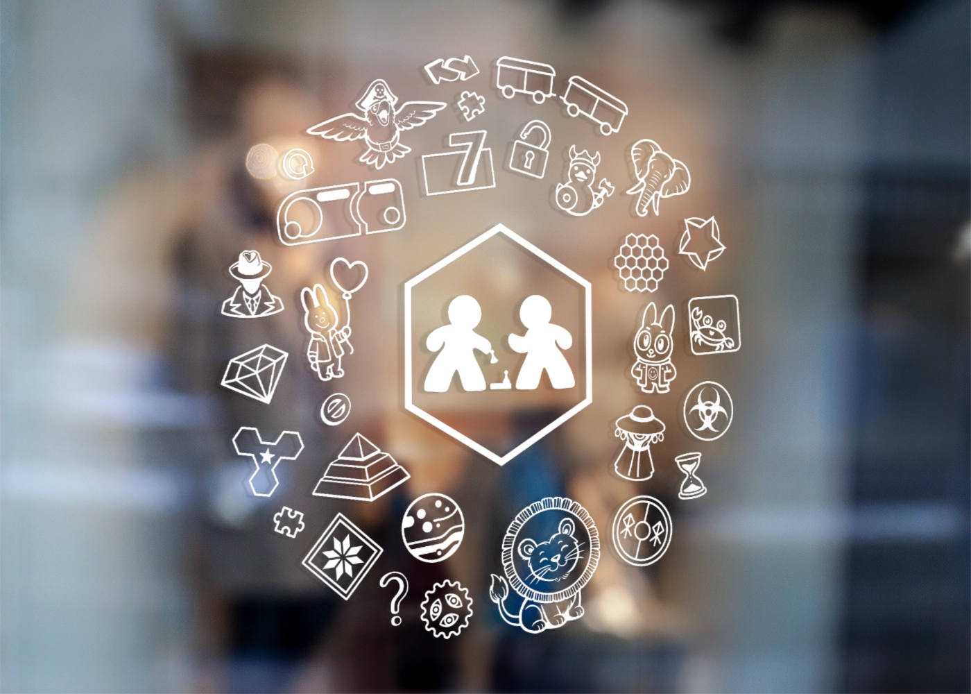
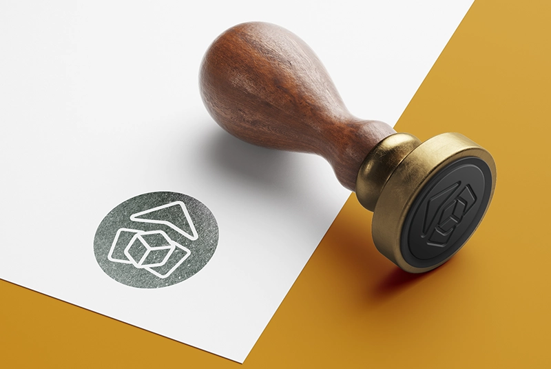
The logo was then adapted for the sign, shopfront, website and printed materials, right down to the game guides tucked into the boxes.
BEHIND THE SCENES
The client already had a visual idea to start from. It contained a lot of detail that would have been difficult to keep in a logo.
I reworked the original design to simplify the shapes and make the logo easier to read, while keeping the intended style. The logo also needed to work on both a large shopfront and a small game guide.
From the logo to the painted décor, I designed and produced the materials to give the whole shop a consistent look.
Le Temple du Carton is at 12 rue du Gouvernement in central Saint-Quentin.
logo before and after
Drag the slider from left to right:


gallery
Click an image to enlarge it:

capsule jeux
THE PROJECT
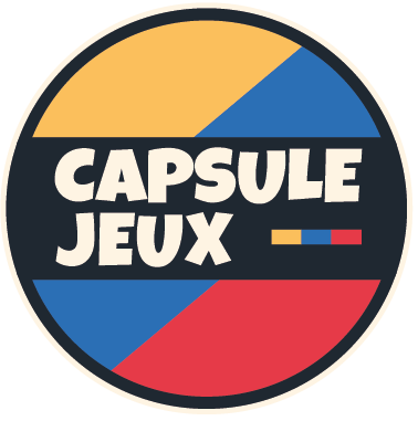
Capsule Jeux is a shop concept built around discovering board games and enjoying them together.
The goal was to create a visual identity that was colourful, playful and easy to recognise, setting the tone from the first encounter with the shop.
BEHIND THE SCENES
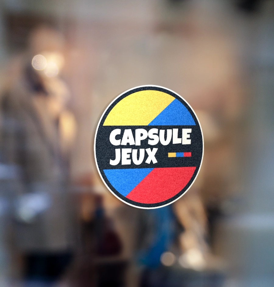
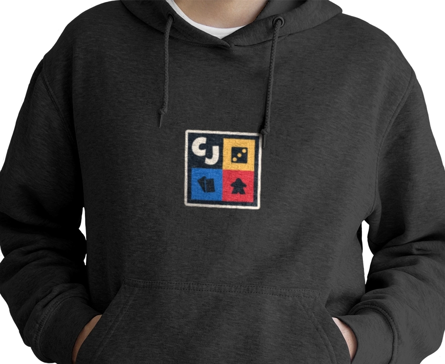
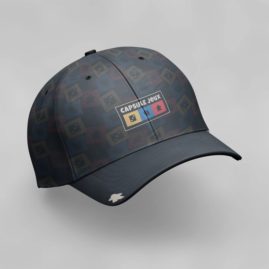
I designed the logo and graphic elements for the brand kit, then adapted them for cards, clothing, packaging and promotional items.
The idea was to keep the same visual identity across all materials, adjusting the composition and scale as needed.
Logo and brand kit design for Capsule Jeux, a board game shop concept, with designs adapted across different materials.
logo before and after
Drag the slider from left to right:


gallery
Click an image to enlarge it:





ni pewma
THE PROJECT
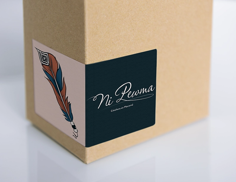
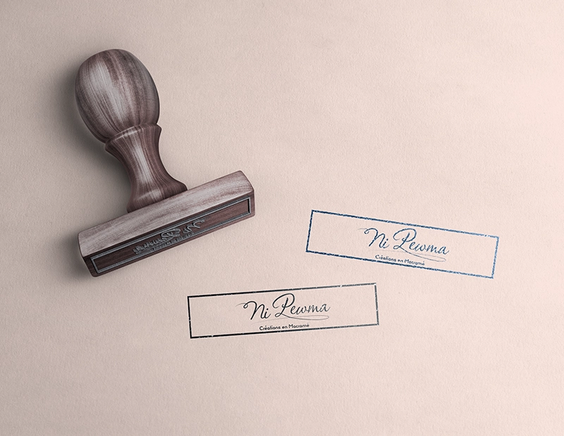
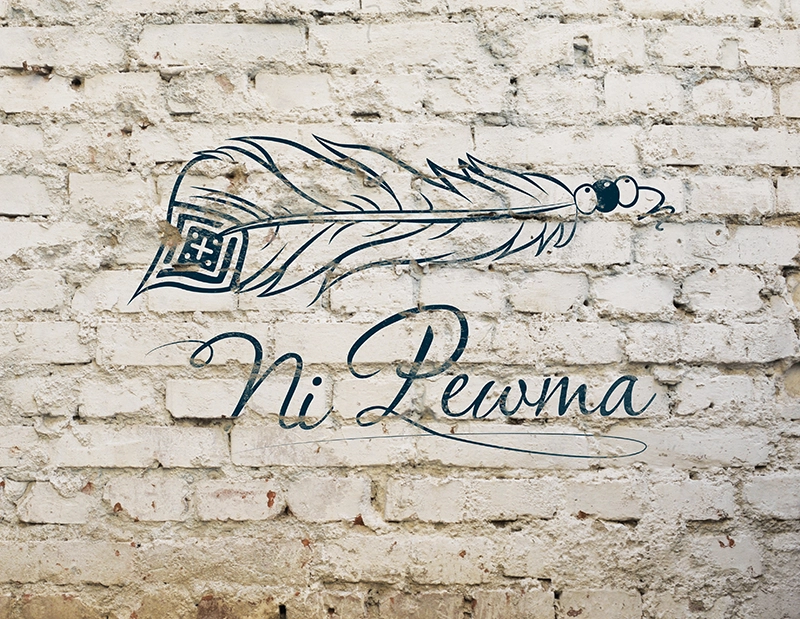
To launch the business, the client wanted to turn their drawing into a logo that would work across different materials while keeping its handmade character and connection to nature.
I also laid the foundations for the visual identity, starting with Facebook and leaving room for the brand’s future needs.
BEHIND THE SCENES
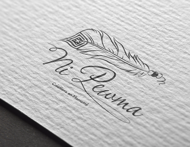
I redrew the illustration as a vector, refining the lines and shapes and balancing the details for a cleaner result, without losing the character of the original drawing.
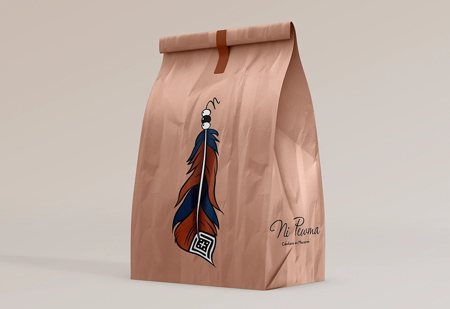
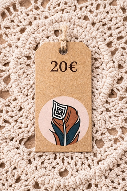
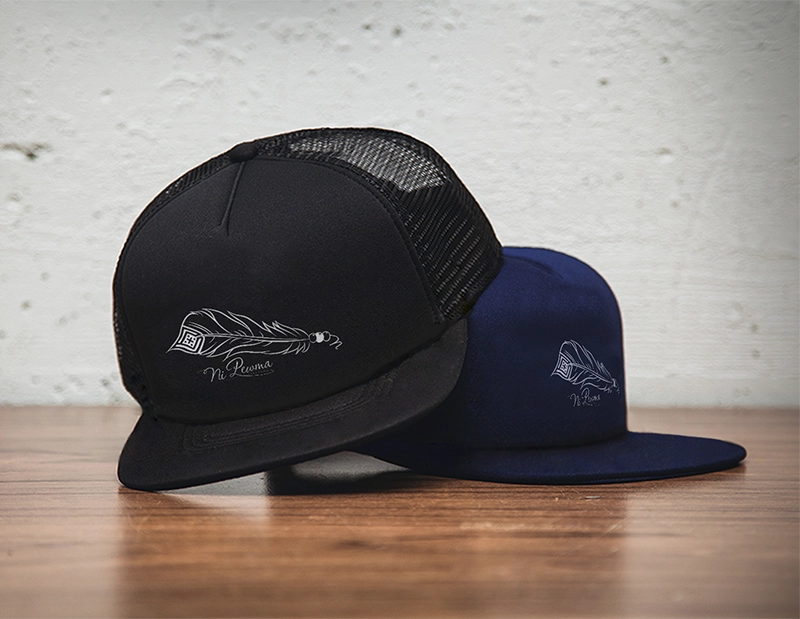
I kept the feather and its geometric pattern. I then prepared the logo in several colours and in monochrome so it could work across different formats and sizes.
Logo and brand kit design for Ni Pewma, a macramé business in Pierrefonds, based on a drawing supplied by the client.
logo before and after
Drag the slider from left to right:


gallery
Click an image to enlarge it:
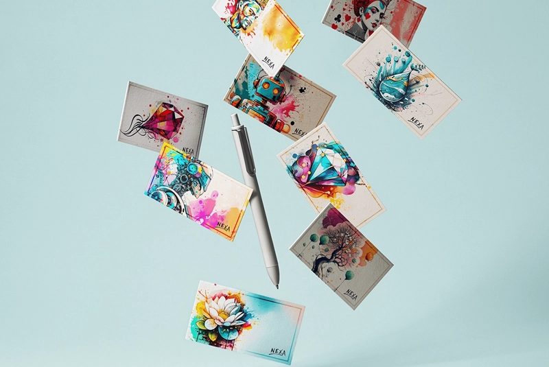
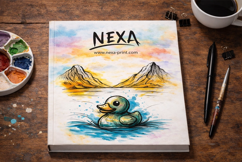
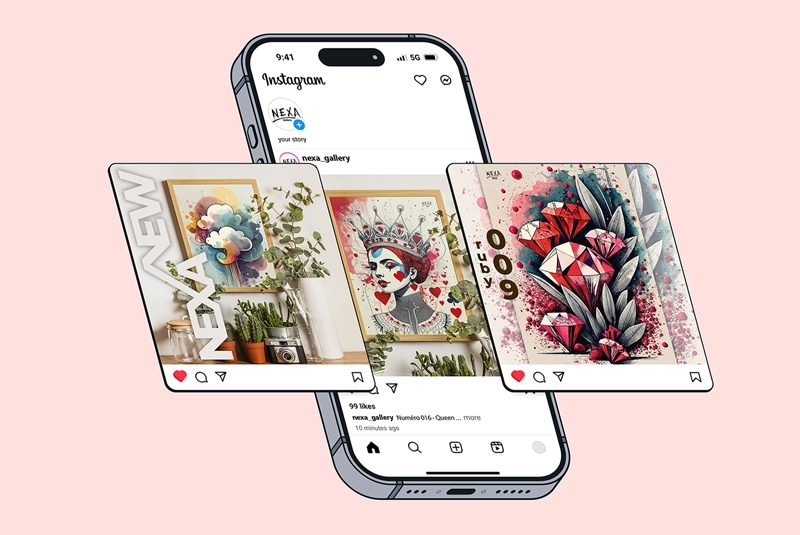
nexa print
THE PROJECT
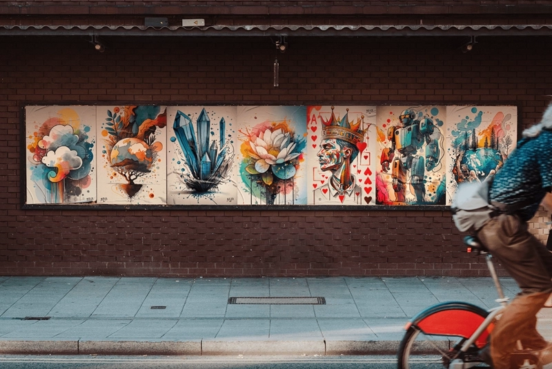
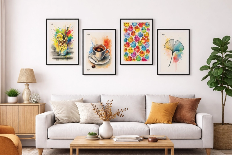
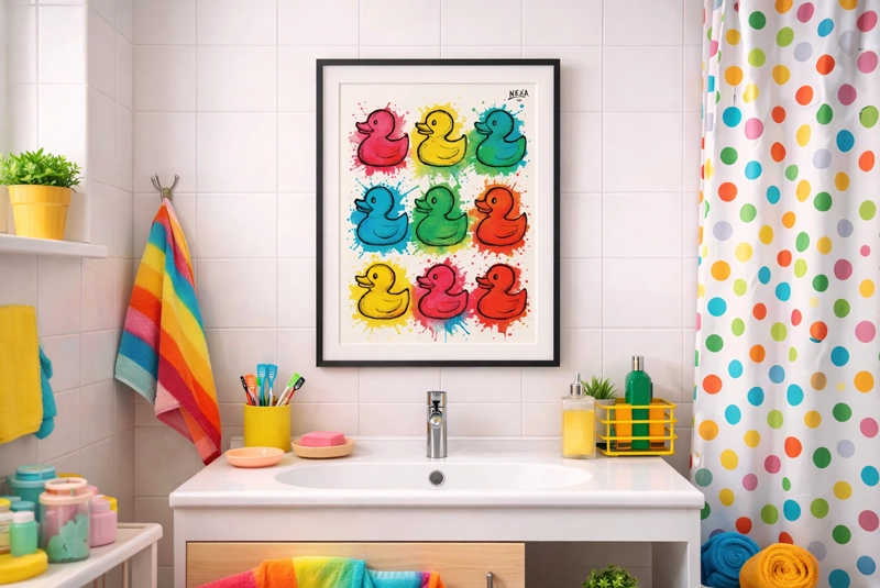
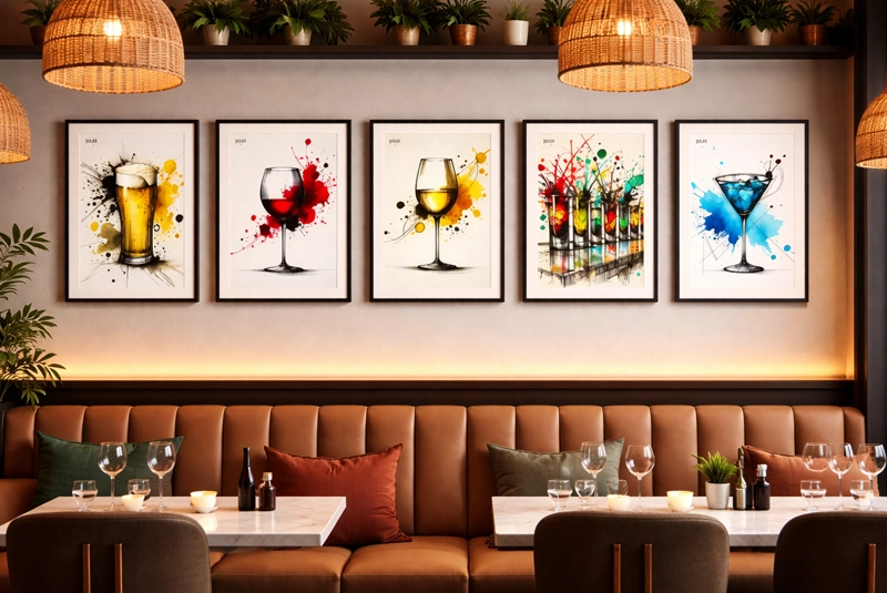
Nexa Print offers free posters to download and print. The project is run by a creator with a passion for AI-generated imagery.
The goal was to give the project a recognisable identity and a website where people could browse and download the artwork.
BEHIND THE SCENES
I designed the logo and visual identity, then built the website using the same visual style.
I also converted the supplied PNG images into print-ready PDF files and created social media templates to keep the style consistent across formats.
Design of the Nexa Print logo, website and visual materials, a project offering free posters made from AI-generated images.
gallery
Click an image to enlarge it:
super mayo
THE PROJECT
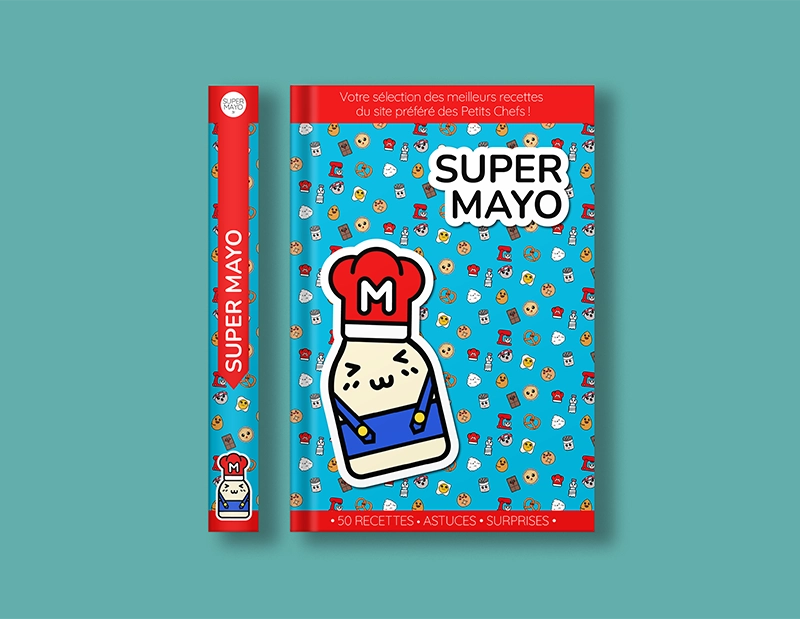
Super Mayo is a batch-cooking app concept. The idea is to prepare several meals in advance to make everyday life easier.
The project also plans to offer recipes and cooking content, so the identity needed to work for both the app and future materials.
BEHIND THE SCENES
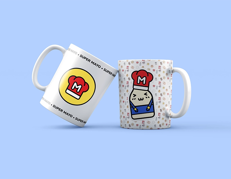
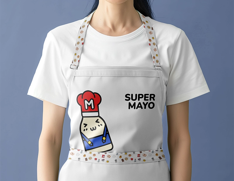
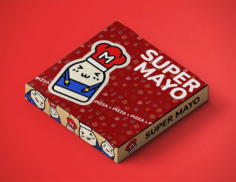
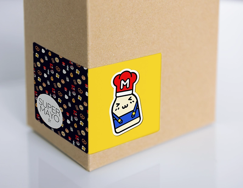
The name pairs ‘Mayo’, the client’s nicknamewith a visual style inspired by Super Mario.
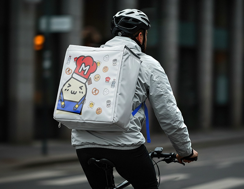
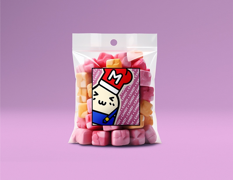
I used bold colours and recognisable elements, then adapted the designs for the web, packaging and merchandise so they would feel consistent across formats.
Design of the Super Mayo visual identity, a meal-planning app project with a colourful visual style inspired by video games.
gallery
Click an image to enlarge it:
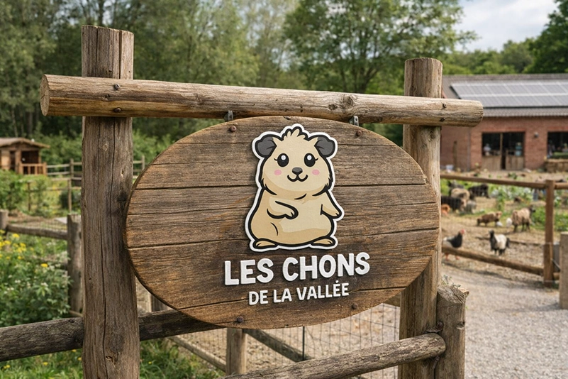
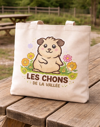
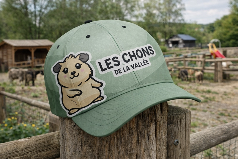
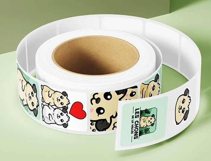
Les Chons de la Vallée
THE PROJECT
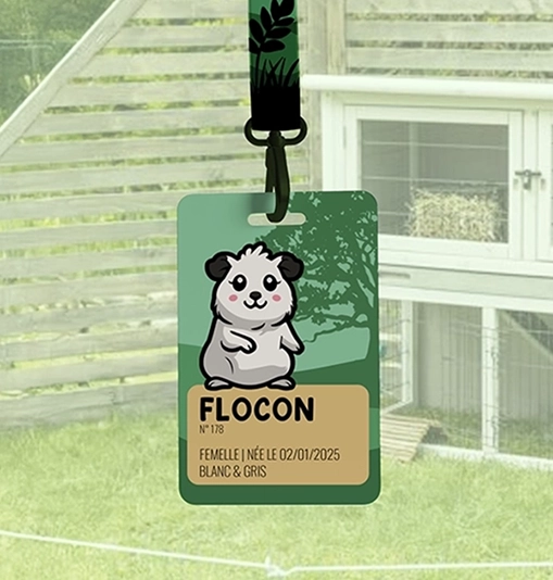
Les Chons de la Vallée is a breeding project in development, centred on nature and animal welfare.
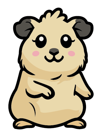
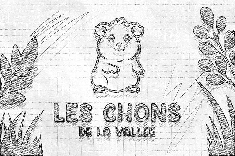
The goal was to create a gentle, warm identity with a recognisable mascot for the breeder’s materials.
BEHIND THE SCENES
I designed the mascot to be easy to adapt to different guinea pigs, especially on their labels, where the main colour can be changed in a few clicks.
I then adapted the designs for clothing, labels and signage, keeping the same visual cues.
Design of the mascot logo and brand kit for Les Chons de la Vallée, with versions for labels, clothing and communications materials.
gallery
Click an image to enlarge it:
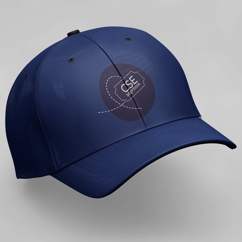
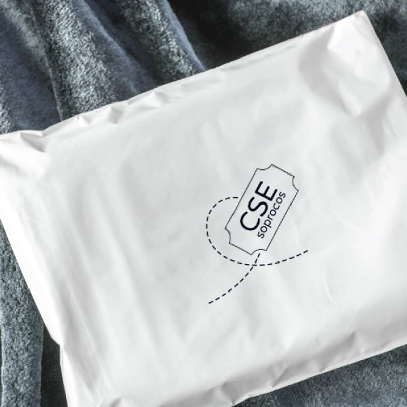
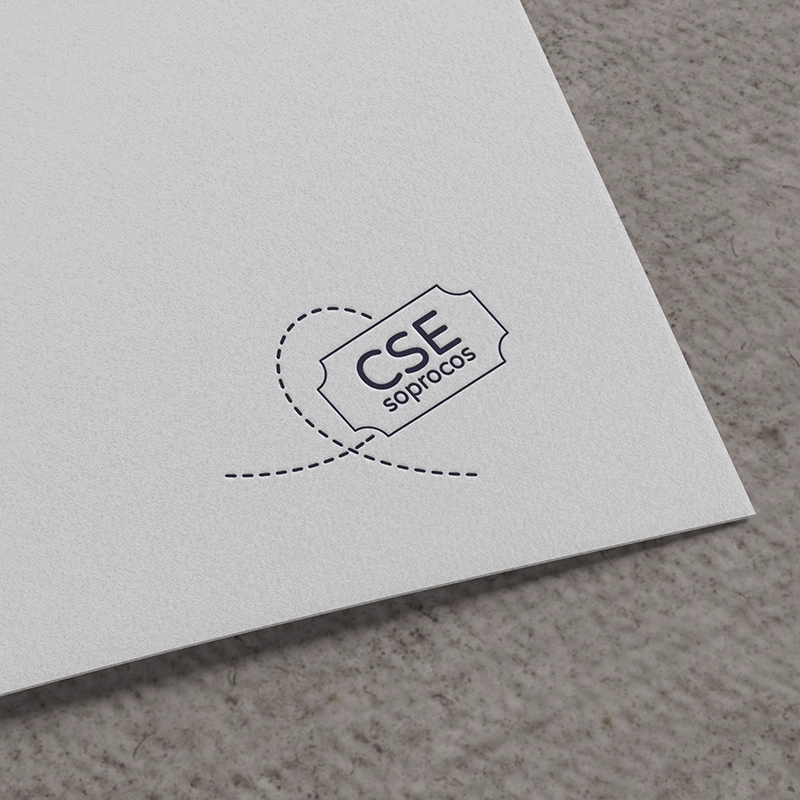
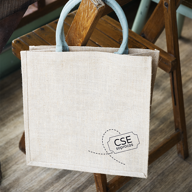
CSE Soprocos (L’Oréal Group)
THE PROJECT
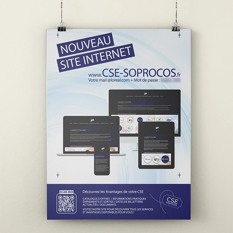
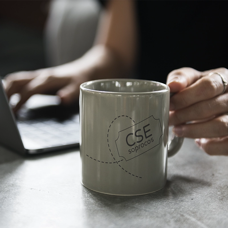
The printed materials help the works council communicate with employees, particularly about the new website.
I also created a logo to give the different materials a shared visual identity.
BEHIND THE SCENES
These designs build on the work I did on the website and much of the blog.
I used the same colours and graphic elements to keep the logo, printed materials and online content consistent.
Design of printed materials and a logo for the Soprocos works council (L’Oréal Group), alongside the work on the website and blog.
cse soprocos (groupe l'oréal)
THE PROJECT
The printed materials help the works council communicate with employees, particularly about the new website.
I also created a logo to give the different materials a shared visual identity.
BEHIND THE SCENES
These designs build on the work I did on the website and much of the blog.
I used the same colours and graphic elements to keep the logo, printed materials and online content consistent.
From the logo to the painted décor, I designed and produced the materials to give the whole shop a consistent look.
Le Temple du Carton is at 12 rue du Gouvernement in central Saint-Quentin.
gallery
Click an image to enlarge it:
dizmo
THE PROJECT
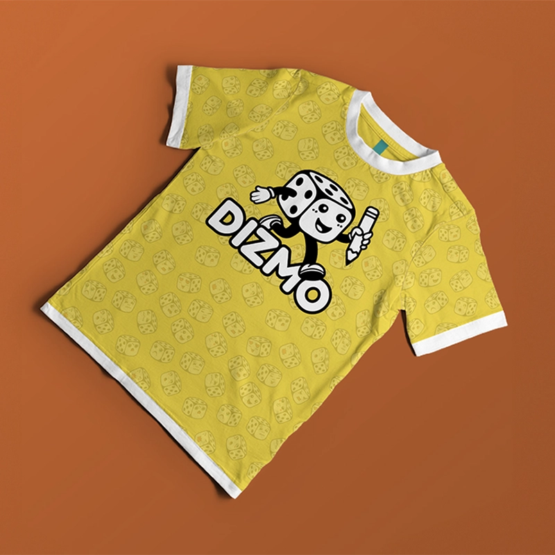
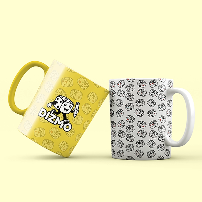
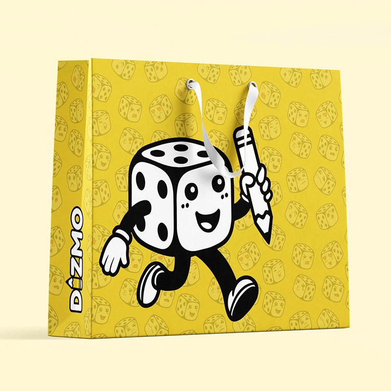
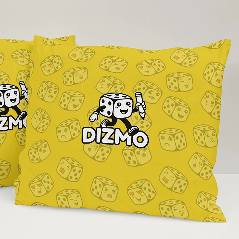
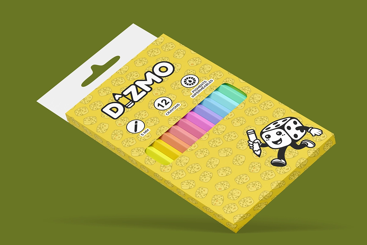
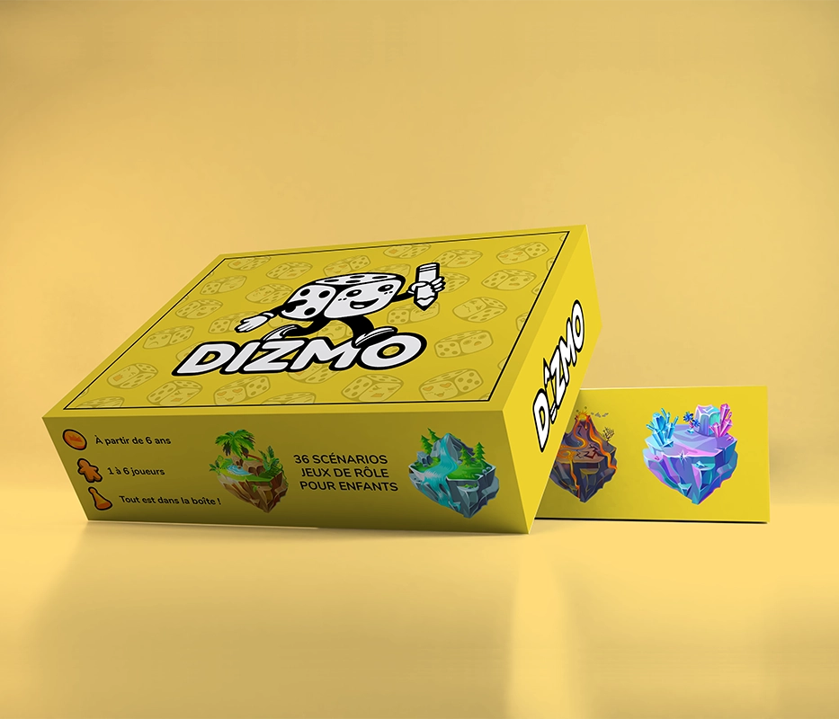
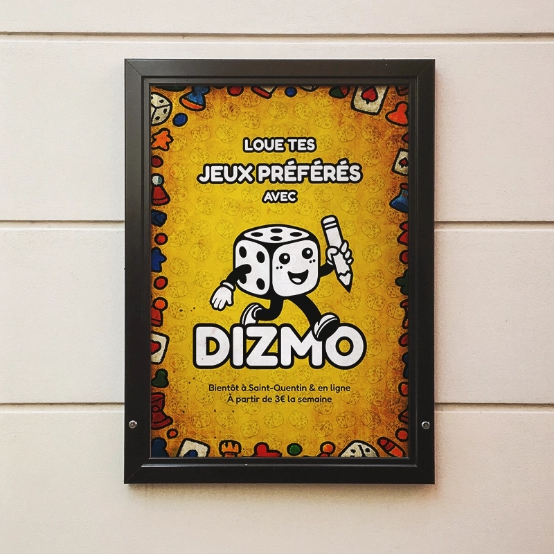
Dizmo is a platform concept for discovering and renting board games.
The aim was to create a playful, accessible visual identity with bold colours and elements that evoke the fun of playing.
BEHIND THE SCENES
I took inspiration from board games when designing the logo, textures and patterns: dice, cards and game pieces.
Simple shapes and colours make it easy to adapt the designs to different formats while keeping the same visual cues.
Design of the Dizmo logo and visual identity, a project that helps people discover and rent board games.
dizmo
THE PROJECT
Design of the logo, visual identity and communications materials for Temple du Carton, a board game and trading card shop in Saint-Quentin.
The logo was then adapted for the sign, shopfront, website and printed materials, right down to the game guides tucked into the boxes.
BEHIND THE SCENES
The client already had a visual idea to start from. It contained a lot of detail that would have been difficult to keep in a logo.
I reworked the original design to simplify the shapes and make the logo easier to read, while keeping the intended style. The logo also needed to work on both a large shopfront and a small game guide.
From the logo to the painted décor, I designed and produced the materials to give the whole shop a consistent look.
Le Temple du Carton is at 12 rue du Gouvernement in central Saint-Quentin.
logo before and after
Drag the slider from left to right:


gallery
Click an image to enlarge it:

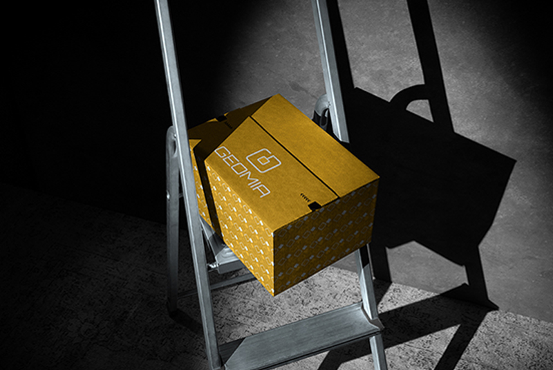
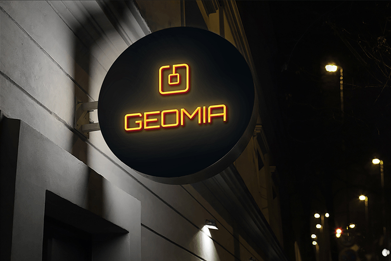
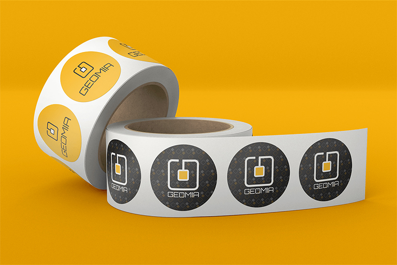
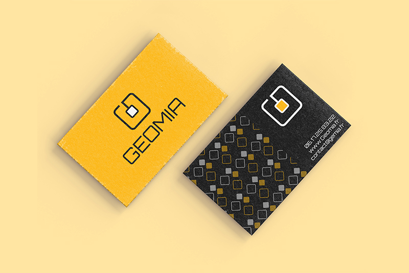
geomia
THE PROJECT
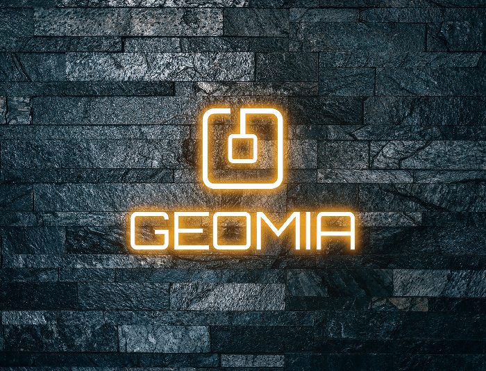
Geomia began as a student project and is developing into a business. The idea is to design a lamp that makes reading more comfortable and adapts to different needs.
The logo needed to stay simple and legible while reflecting the product.
BEHIND THE SCENES
I incorporated the letter G into a stylised reading lamp, bringing the name and the object together in one symbol.
I then developed a pattern from the logo so the visual identity could carry across different materials.
Design of the logo and a graphic pattern for Geomia, a reading lamp project designed for different visual needs.
geomia
THE PROJECT
Design of the logo, visual identity and communications materials for Temple du Carton, a board game and trading card shop in Saint-Quentin.
The logo was then adapted for the sign, shopfront, website and printed materials, right down to the game guides tucked into the boxes.
BEHIND THE SCENES
The client already had a visual idea to start from. It contained a lot of detail that would have been difficult to keep in a logo.
I reworked the original design to simplify the shapes and make the logo easier to read, while keeping the intended style. The logo also needed to work on both a large shopfront and a small game guide.
From the logo to the painted décor, I designed and produced the materials to give the whole shop a consistent look.
Le Temple du Carton is at 12 rue du Gouvernement in central Saint-Quentin.
logo before and after
Drag the slider from left to right:


gallery
Click an image to enlarge it:
O'Ekaki
THE PROJECT
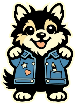
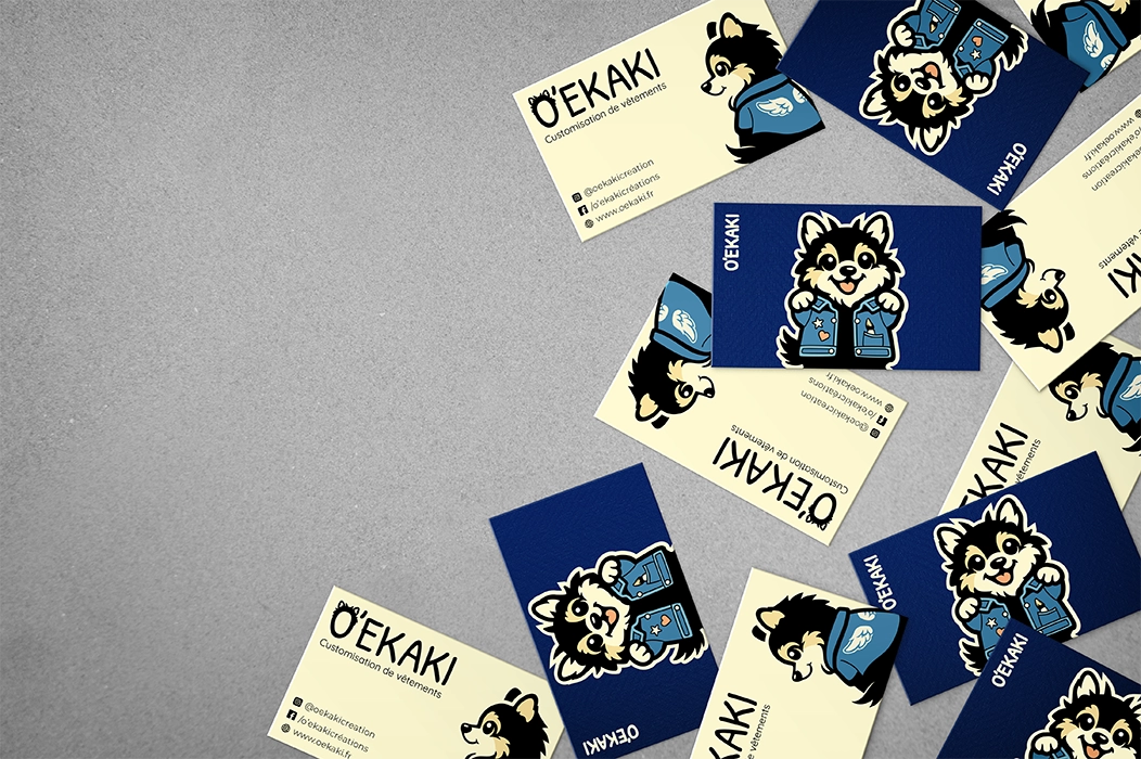
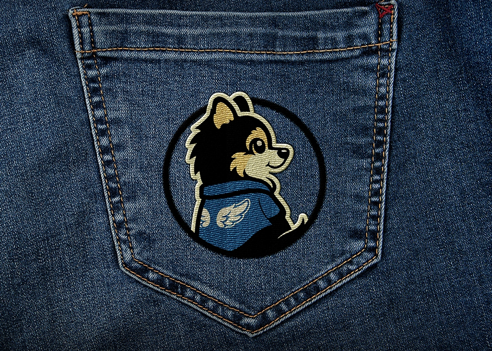
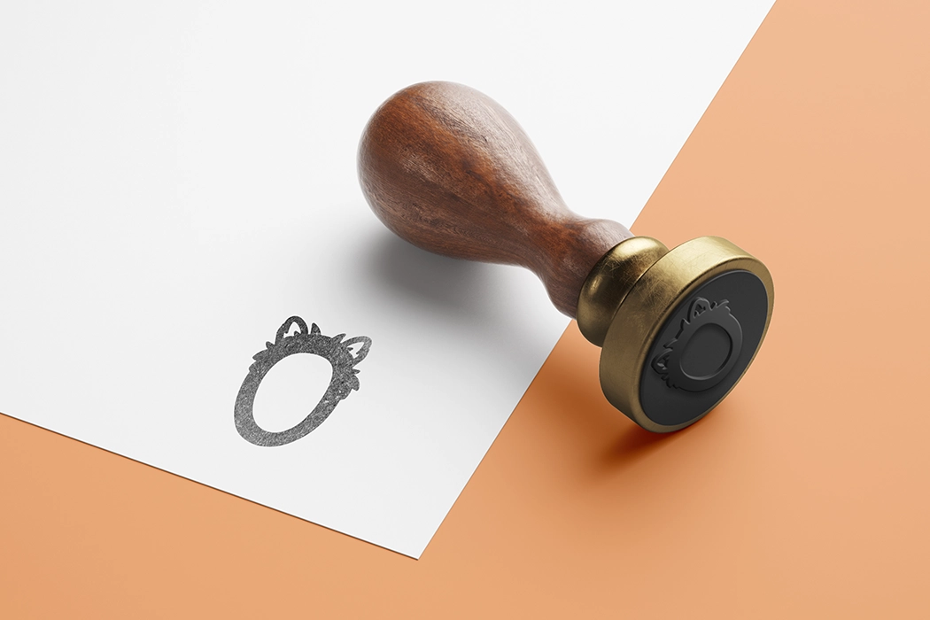
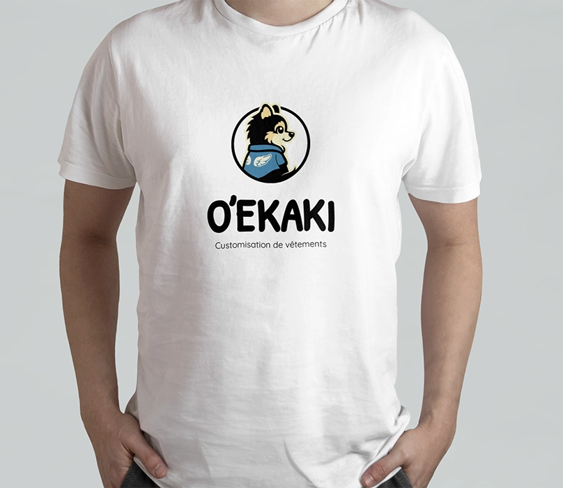
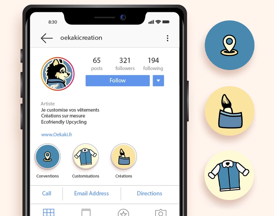
O’ekaki wanted a warm, illustrated identity to represent its custom creations.
The brief called for a dog mascot that could be incorporated into the logo and reflect the business.
BEHIND THE SCENES
I gave the mascot a customised denim jacket and a paintbrush, echoing the decorated clothing and handmade work.
These details show what the business does while giving the character personality.
Design of the O’ekaki logo and visual identity, a business that customises clothing and objects by hand.
o'ekaki
THE PROJECT
Design of the logo, visual identity and communications materials for Temple du Carton, a board game and trading card shop in Saint-Quentin.
The logo was then adapted for the sign, shopfront, website and printed materials, right down to the game guides tucked into the boxes.
BEHIND THE SCENES
The client already had a visual idea to start from. It contained a lot of detail that would have been difficult to keep in a logo.
I reworked the original design to simplify the shapes and make the logo easier to read, while keeping the intended style. The logo also needed to work on both a large shopfront and a small game guide.
From the logo to the painted décor, I designed and produced the materials to give the whole shop a consistent look.
Le Temple du Carton is at 12 rue du Gouvernement in central Saint-Quentin.
logo before and after
Drag the slider from left to right:


gallery
Click an image to enlarge it:

unik
THE PROJECT
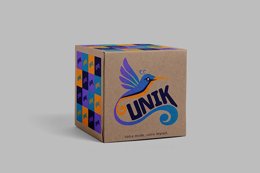
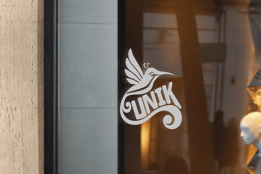
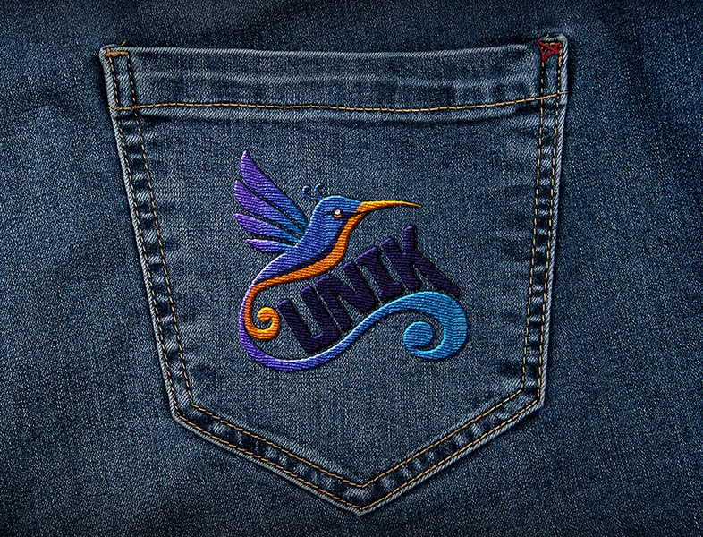
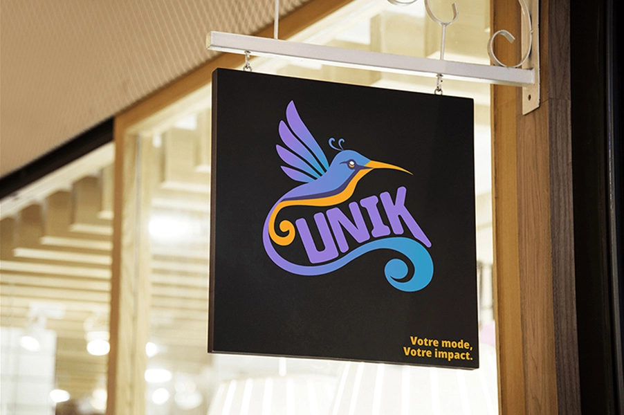
UNIK offers a selection of second-hand clothing, with a focus on distinctive, affordable pieces.
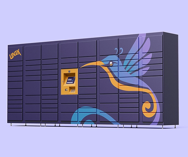
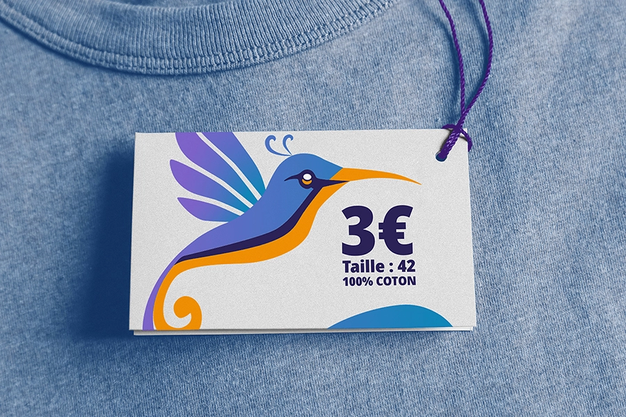
The goal was to create a colourful, recognisable identity that fit the world of second-hand fashion.
BEHIND THE SCENES
I built the logo around a hummingbird, to suggest movement and the individual character of each piece.
The name is built into the design to form a single symbol. Bright colours give it character and make it easy to spot across different materials.
Design of the UNIK logo and visual identity, a project selling second-hand clothing.
unik
THE PROJECT
Design of the logo, visual identity and communications materials for Temple du Carton, a board game and trading card shop in Saint-Quentin.
The logo was then adapted for the sign, shopfront, website and printed materials, right down to the game guides tucked into the boxes.
BEHIND THE SCENES
The client already had a visual idea to start from. It contained a lot of detail that would have been difficult to keep in a logo.
I reworked the original design to simplify the shapes and make the logo easier to read, while keeping the intended style. The logo also needed to work on both a large shopfront and a small game guide.
From the logo to the painted décor, I designed and produced the materials to give the whole shop a consistent look.
Le Temple du Carton is at 12 rue du Gouvernement in central Saint-Quentin.
gallery
Click an image to enlarge it:
Need a website, a logo or a design for print or digital?
Let’s talk about your project.
Starting a business and need a website?
Tell me what you have in mind, even if it’s still just an idea.
Starting a business and need a website?
Tell me what you have in mind, even if it’s still just an idea.